
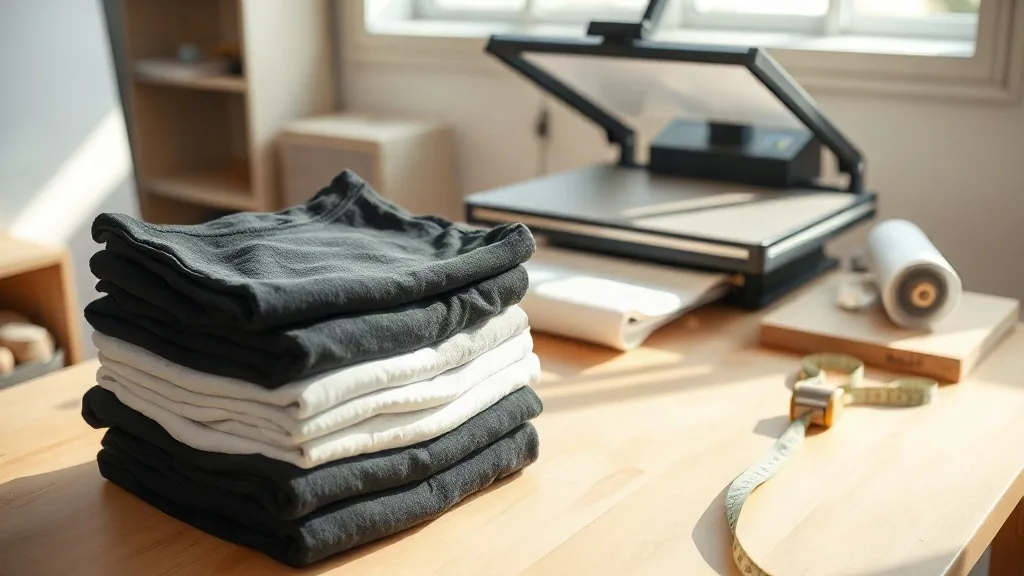
Most people judge a printed tee in the wrong order. They look at the design first, the color second, and the shirt itself almost never. That order is backward. A graphic can only look as good as the surface it sits on, and anyone who has pulled a stiff, cracking transfer off a cheap blank knows exactly what that means. This is where shaka wear earns its place in a print shop conversation: not as a logo on a label, but as a fabric decision that quietly determines whether your transfer looks sharp for years or peels in the first wash.
Below is a practical look at why these blanks behave so well under heat and pressure, how to match fabric weight to the job, and where a smarter gangsheet layout turns a decent bulk order into a genuinely profitable one.
What Actually Makes a Blank Good for DTF
Direct-to-film transfers are a thin layer of pigment and adhesive. That layer has to bond to fibers and then move with them. If the fabric is loose, fuzzy, or coated with a heavy silicone softener, the adhesive grabs the coating instead of the yarn, and the print sits on top like a sticker. If the fabric is dense, tightly knit, and finished with a light hand, the adhesive penetrates properly and the film disappears into the surface.
Shaka Wear's heavyweight cotton tees lean toward the second category. The knit is compact, the surface is smooth rather than brushed, and the hand feel is dry instead of slippery. In practice, that means a lower press temperature works, dwell time is more forgiving, and the edges of the transfer stay crisp instead of bleeding into the grain of the fabric.
Weight Changes Everything
Fabric weight is measured in ounces per square yard, and the difference between a 5.5 oz and a 7 oz jersey is not cosmetic. Heavier fabric holds more heat during pressing, which gives the adhesive more time to flow into the fibers before the press opens. That extra thermal mass is why a 7 oz ring-spun tee tends to produce a flatter, more durable bond than a lightweight fashion blank, even with identical film and identical settings.
There is a trade-off. Heavyweight cotton takes slightly longer to cool, and stacking freshly pressed shirts too soon traps heat and can leave dull spots on the print. Let each piece rest flat for a few seconds before you stack it. It is a small habit that saves a lot of reprints.
Color Is Part of the Print
A transfer with white ink needs an opaque base layer, and that base layer shows through on light garments if the printer is not set up correctly. On a white or natural blank, you can often drop the white underbase entirely, which produces a softer hand and a faster press cycle. On black or navy, the underbase has to be solid, and the garment color itself becomes part of the design contrast.
Shaka Wear's color range is deep enough to plan around this. Their black is a true black rather than a washed charcoal, so white and bright inks pop without extra passes. Their heathers and muted tones are consistent across sizes, which matters when you are building a run of forty shirts in the same colorway and cannot afford a visible shade shift between a medium and a double extra large.
Matching the Blank to the Job
Not every order needs the same shirt. A quick way to think about it:
- Retail and merch drops: heavyweight ring-spun cotton with a structured body. Customers expect a shirt that feels substantial on the hanger and keeps its shape after ten washes.
- Team and event apparel: midweight, boxy fit, forgiving sizing. Comfort over structure, because people will wear it once a week for a season.
- Streetwear and small-batch brands: oversized cuts with dropped shoulders. These garments take large front and back prints well, and heavyweight fabric prevents the print from dragging the shirt out of shape.
- Sampling and mockups: cheaper blanks are fine here, as long as the color matches the final garment. Do not approve a print on a light blank if the production run is on black.
One detail worth checking before you commit to a large order: measure the chest and body length of a sample in your actual size. Boxy fits can run generous, and a print placement that looked centered on a flat lay can sit noticeably high or low on a body. Press one sample, wear it, photograph it, then scale up.
Press Settings That Respect the Fabric
Every press, film, and adhesive combination has its own sweet spot, so treat these as starting points rather than fixed rules. Press a test piece and adjust from there.
- Pre-press the garment for three to five seconds. This drives out moisture, which is the single most common cause of a transfer that looks fine on day one and lifts after the first wash.
- Press at roughly 300 to 320 degrees Fahrenheit with medium to firm pressure. Heavyweight cotton can take firmer pressure than a lightweight blend, and the tighter knit benefits from it.
- Peel while warm for a matte, integrated finish, or cold for a slightly glossier look. Test both on a scrap before you pick a direction for the whole run.
- Repress with a cover sheet for five to eight seconds. This step is skipped constantly and it is the one that locks the edges down.
If the print feels plasticky or the edges lift, the usual culprit is not the film. It is insufficient pressure, a cold spot on the platen, or a garment that was not dried before pressing.
Where the Real Cost Savings Come From
Ask a print shop what eats their margin and the answer is almost never ink. It is setup time, wasted film, and short runs that never quite fill a sheet. This is the practical argument for a DTF Gangsheet Builder: you arrange multiple designs onto one continuous film at whatever length you need, so a run of twelve different graphics becomes one print job instead of twelve.
The savings compound in three places. Film waste drops because you are packing artwork edge to edge rather than printing each design on its own sheet. Labor drops because there is one load, one press cycle, and one cut pass. And inventory risk drops, because you can order exactly the quantity you need for a small drop instead of committing to a minimum that leaves you with dead stock.
On heavyweight Shaka Wear blanks specifically, gangsheets make small-batch experimentation realistic. You can test four colorways of the same design across four garment colors in a single print run, see which one sells, and reorder only the winner. That is a very different business model from guessing at volume and hoping.
Two habits make gangsheets work better. First, leave a small gutter between designs so your cutter has clean lines to follow. Second, group designs by ink density, because a sheet packed with heavy white underbases will need a slower print pass than one with mostly single-color line art. Mixing the two on one sheet is possible, but it rarely produces the sharpest result.
Common Questions from Print Shops and Small Brands
Do Shaka Wear blanks need a special pretreatment for DTF?
No pretreatment is required for DTF transfers the way it is for DTG printing on dark garments. The film carries its own adhesive. What does help is a short pre-press to remove moisture and a lint roller pass, since loose fibers on heavyweight cotton are the main thing that gets trapped under the adhesive.
Will a DTF print crack on a heavyweight cotton tee?
Cracking almost always traces back to undercuring or overstretching, not to fabric weight. Heavyweight cotton actually reduces cracking because the garment does not distort as much during wear. Press with firm pressure, repress after peeling, and wash the finished shirt inside out in cold water.
How many designs fit on one gangsheet?
It depends entirely on design size and sheet length. A sheet built for small chest logos will hold far more artwork than one built for full back prints. The practical approach is to plan the sheet around your largest design first, then fill the remaining space with smaller pieces rather than starting from the small ones.
Is heavyweight always the better choice for merch?
Not always. Heavyweight reads as premium and holds structure, which suits retail drops and streetwear. But for warm-weather events or anything meant to be worn hard and washed often, a midweight blank is more comfortable and just as printable. Match the weight to how the garment will actually be worn, not to what sounds impressive on a spec sheet.
What is the biggest mistake when ordering blanks in bulk?
Approving the print on the wrong garment color, or ordering a full run before pressing a single sample. Press one shirt, wash it, and look at it in daylight. That one test costs a few minutes and prevents the far more expensive mistake of discovering a placement or color issue across two hundred finished pieces.